We actively utilized Webflow in the front-end phase of developing two websites to support YouParcel's logistics network.
Development Process:
- Design and Template Selection: Fabrikod utilized Webflow's ready-made templates for both sites. These templates allowed for a quick start to the projects and the rapid creation of a basic design framework. The selection of templates was made considering the brand identity and the needs of the target audience.
- Customization and Content Management: The chosen templates were customized by Fabrikod's design team to fit the brand's visual identity. Webflow's visual editor enabled the team to make real-time design changes and easily manage content.
- Embedded Code Usage: For both sites, when customized functions and interactive elements beyond Webflow's provided templates were needed, the embedded code feature came into play. This feature allowed the integration of custom JavaScript codes, third-party APIs, and other customized back-end functions into the sites. This approach enhanced the functionality of the sites while still leveraging Webflow's user-friendly interface.
Ship7
Ship7.com is a platform offering international shopping and shipping services. It delivers products you purchase from popular e-commerce sites in Turkey, America, and the UK right to your door. With the efficient interface integration of Webflow and the flexibility to write embedded code, Ship7 has become a unique project developed by Fabrikod.
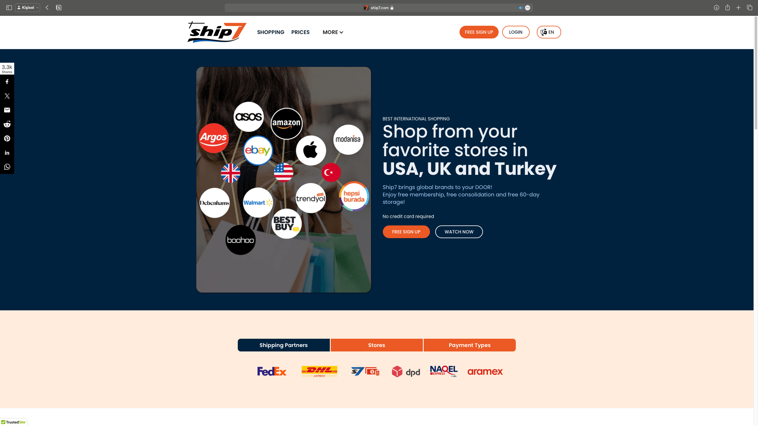 Thanks to our simple and minimal Webflow theme, we created an understandable website. The homepage that greets us upon first entry presents the project's general objectives with clear titles. Immediately below, the company's shipping partners, some of the e-commerce sites the company acts as an intermediary for, and payment methods appear minimized in a tab bar view. Throughout our website, we aimed to maintain this simplicity and clarity.
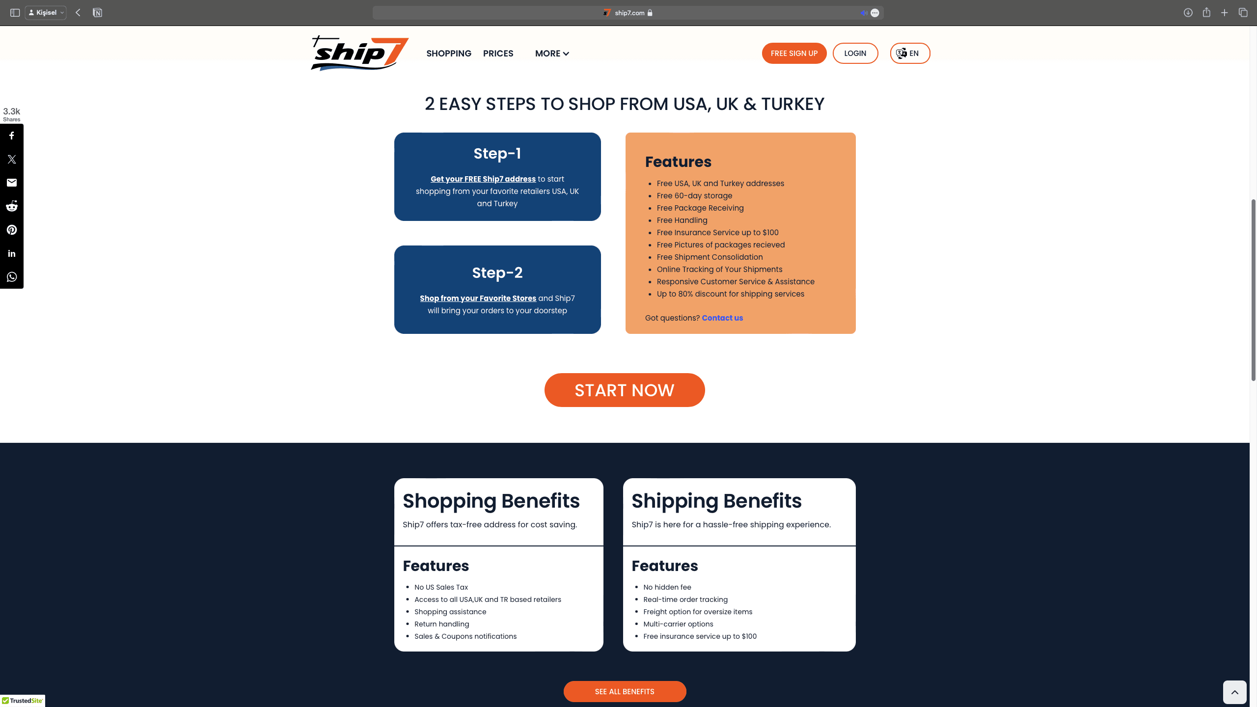 As we scroll down the homepage, we developed Webflow components suitable for Ship7's services in accordance with the website's theme. The presence of multiple buttons on the screen increases the user's inclination to use the product.
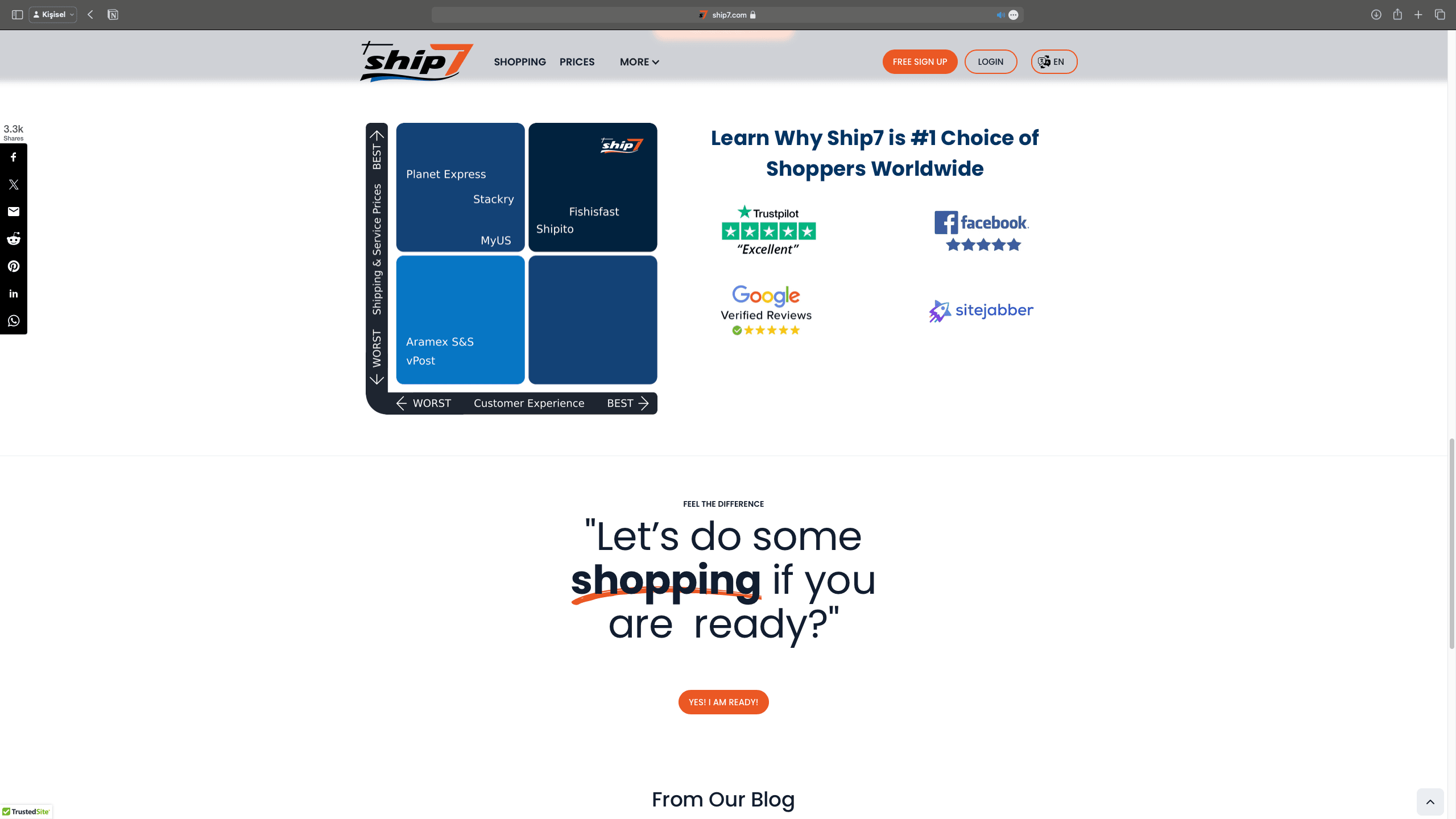 Continuing down the main page, users are presented with several components demonstrating Ship7's meticulous service. These components, although only a fraction of what Webflow is capable of, possess all the features used by modern websites. Developing more with Webflow is always possible.
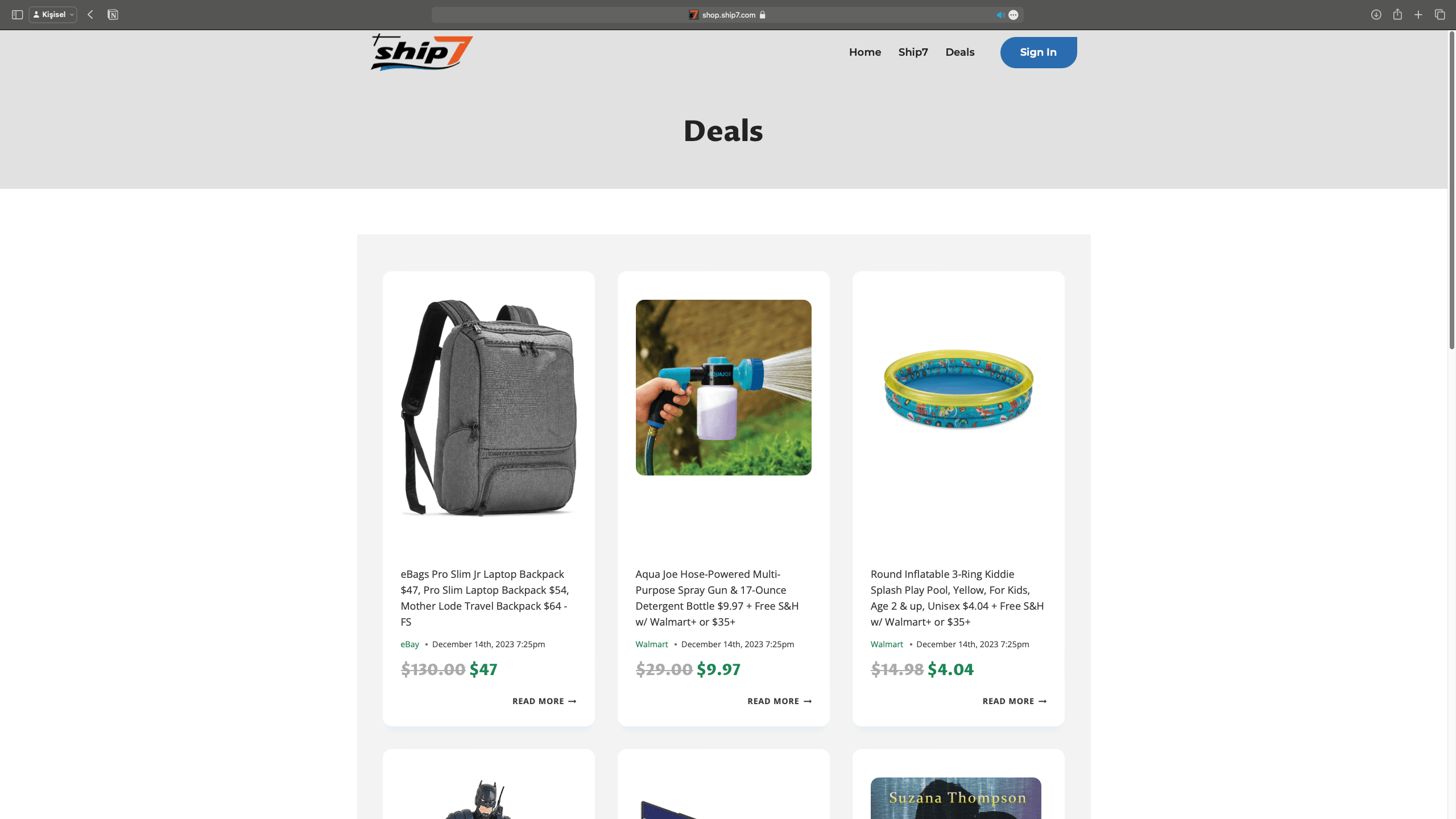 Transitioning to the 'Shopping' page from the main page reveals a familiar interface. In this e-commerce site appearance, we powered our listed products and product cards with embedded code.
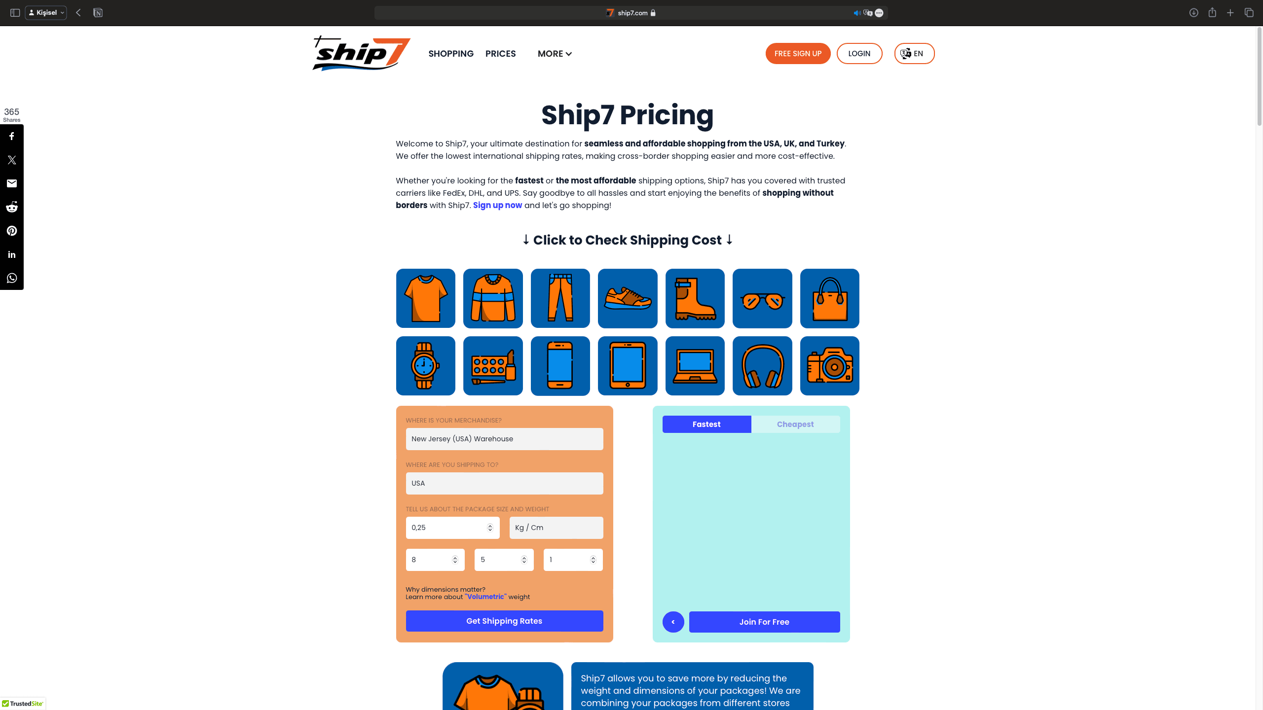 On the Prices page, we encounter numerous components related to Ship7's pricing.
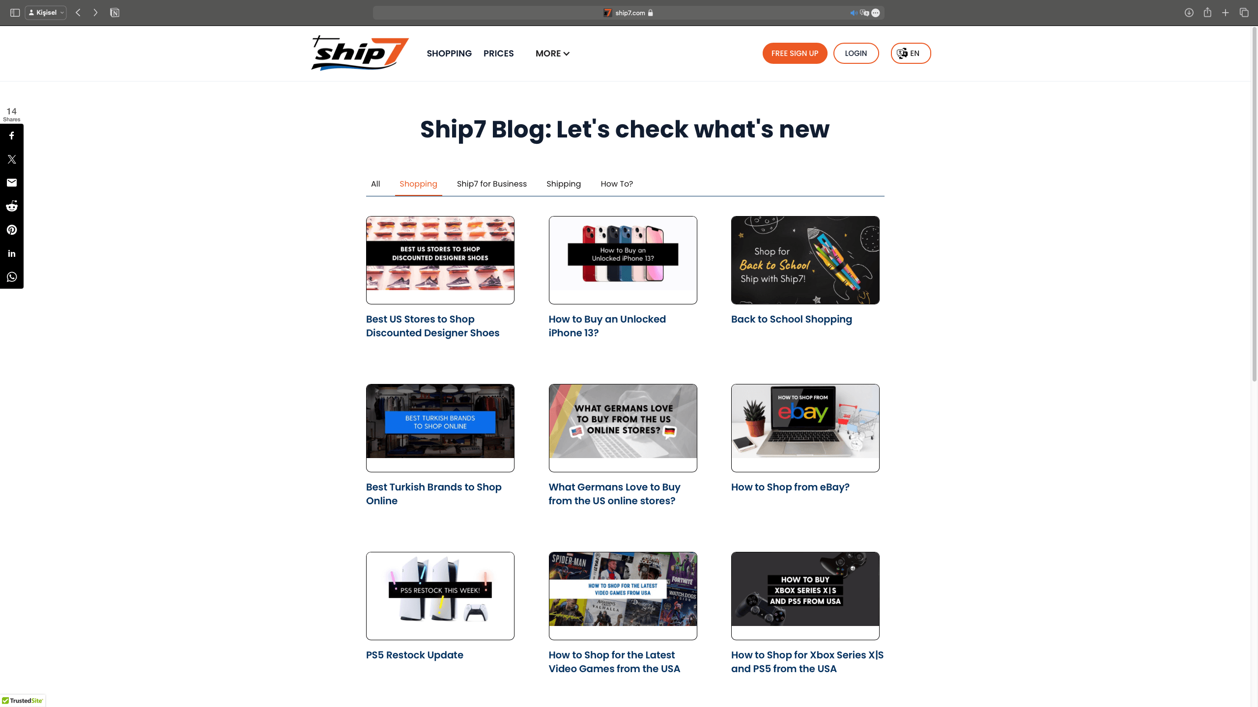 A blog site was designed for Ship7 to keep users informed with current information. Thanks to Webflow's easy and adaptable blog templates, blog posts appear in three rows on a standard page.
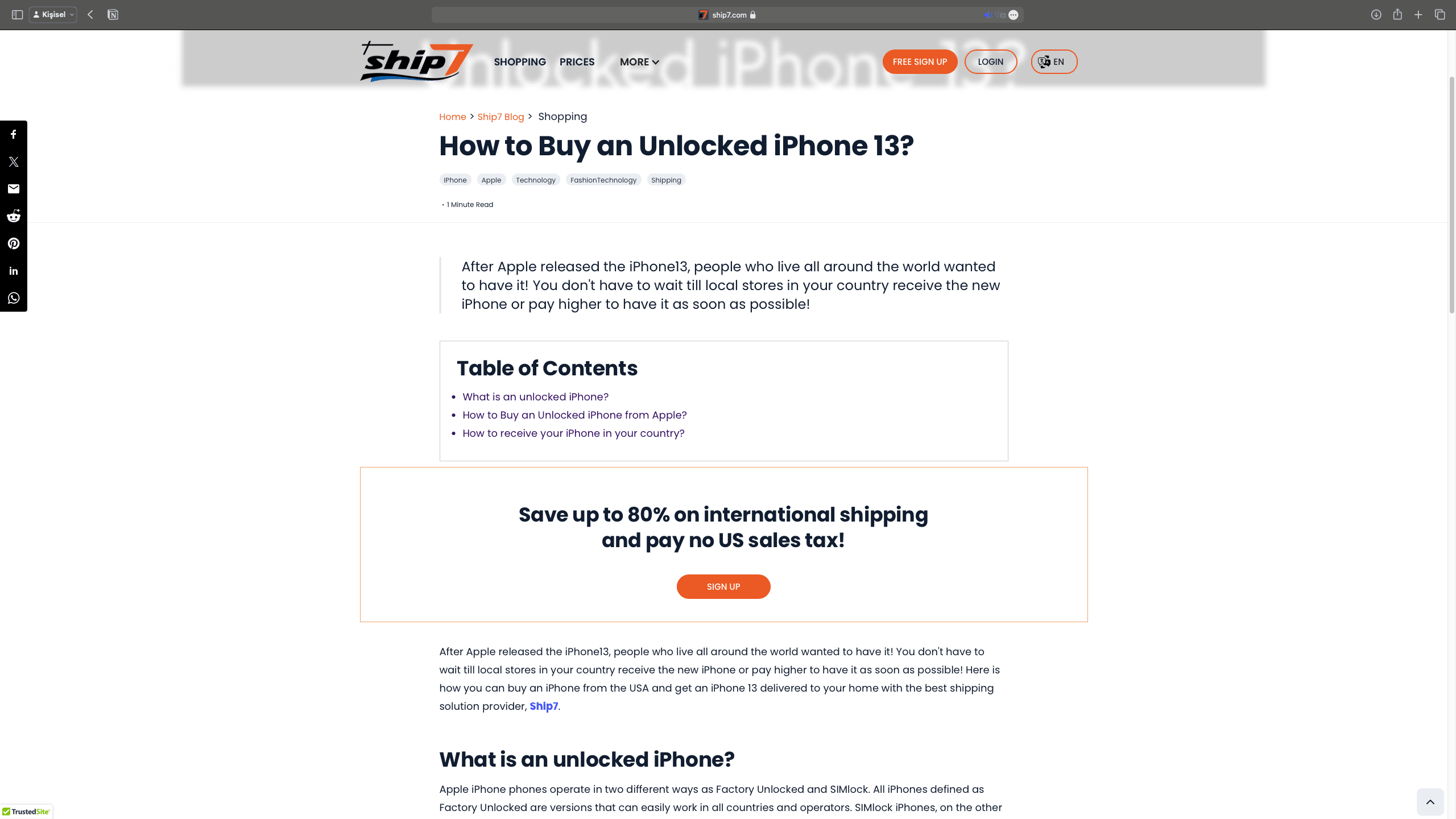 Inside the blog pages, users are met with a simple and readable blog page. We enjoyed developing the Ship7 project as a team, and our improvements continue. In developing Ship7's front-end and interfaces using Webflow, we also benefited from the power of working with Webflow's embedded code on the coding side.
Shipixy
Shipixy.com aims to provide users with fast, reliable, and easy-to-use shipping and logistics services. In doing so, we prioritized creating a clear and uncomplicated appearance.
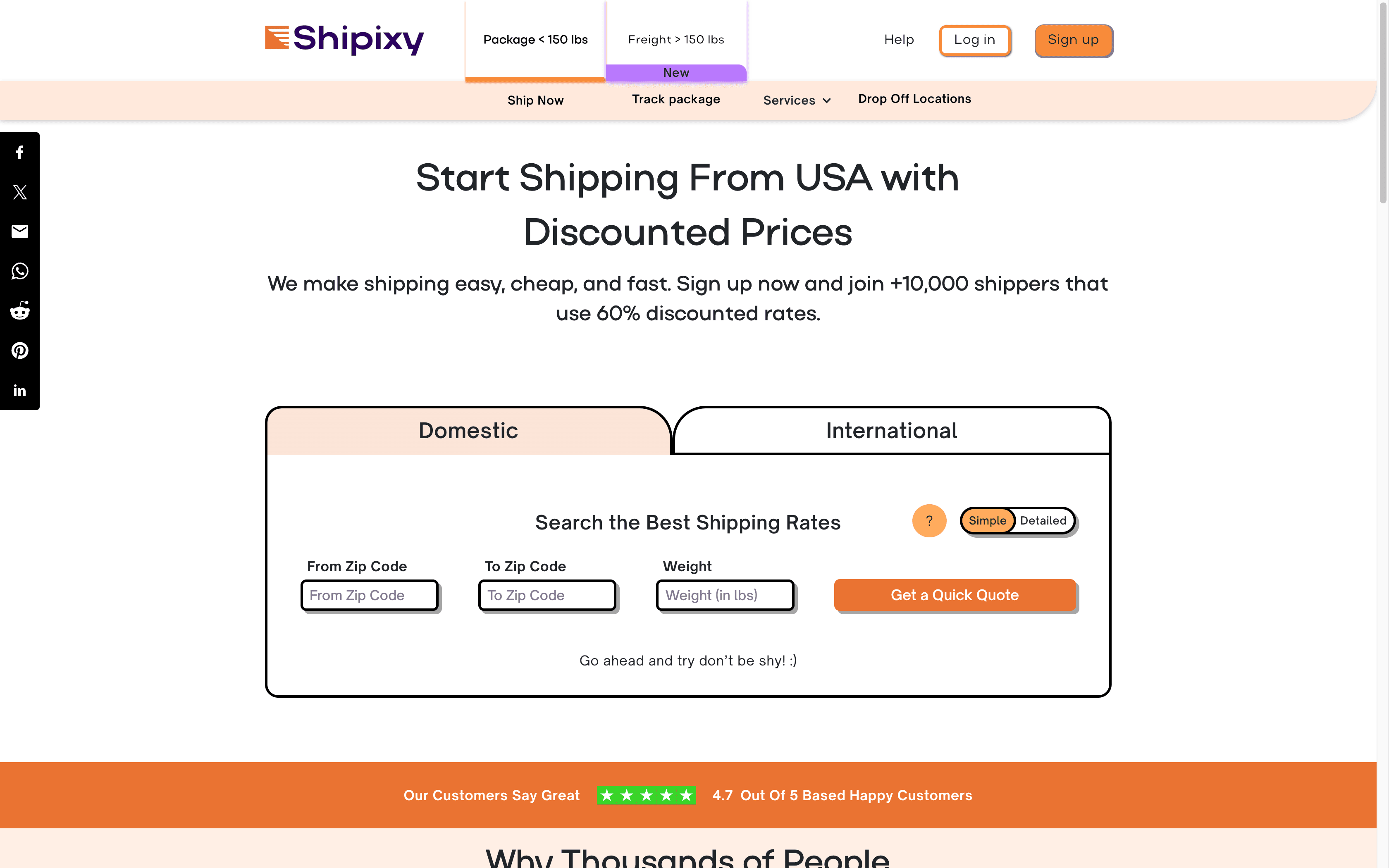 Upon first entry to the site, we encounter one of Webflow's templates. We enhanced the user experience with various buttons added on top of the existing theme. Our designers developed new buttons suitable for the theme in Webflow and added them to the view, allowing users to perform transactions through these buttons. Exploring the site, you will notice that the operations are performed without any delay, thanks to the power of Webflow in design and JavaScript, TypeScript, Vue.js in coding.
Offering both Domestic and International shipping options, the company aims to provide quick quotes related to these areas, while we simplify the entire process with components suitable for the existing theme.
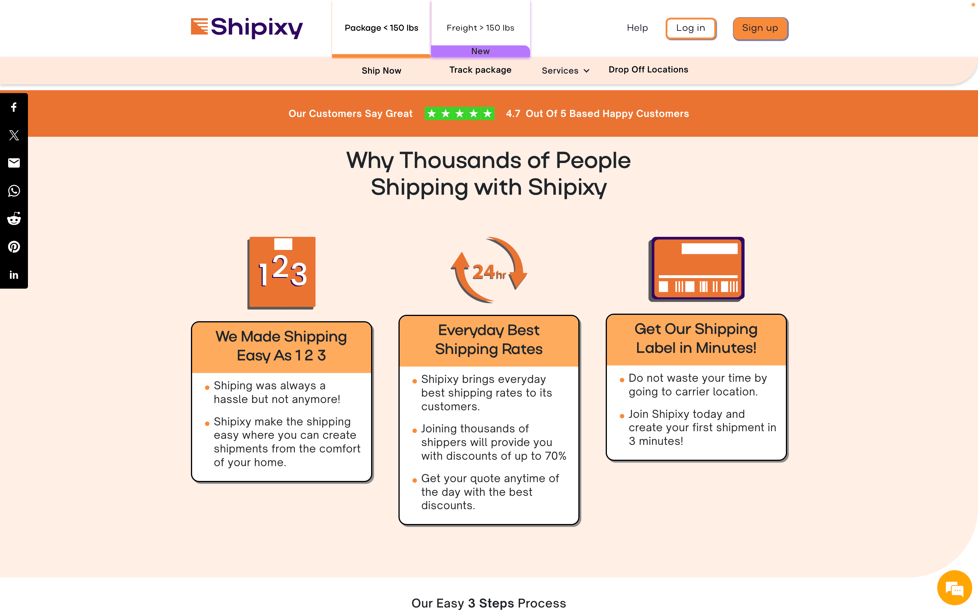 Scrolling further down the landing page, we make the shipping process more understandable and readable with large fonts. In two-colored components, we guide users to understand and embrace the product at a glance.
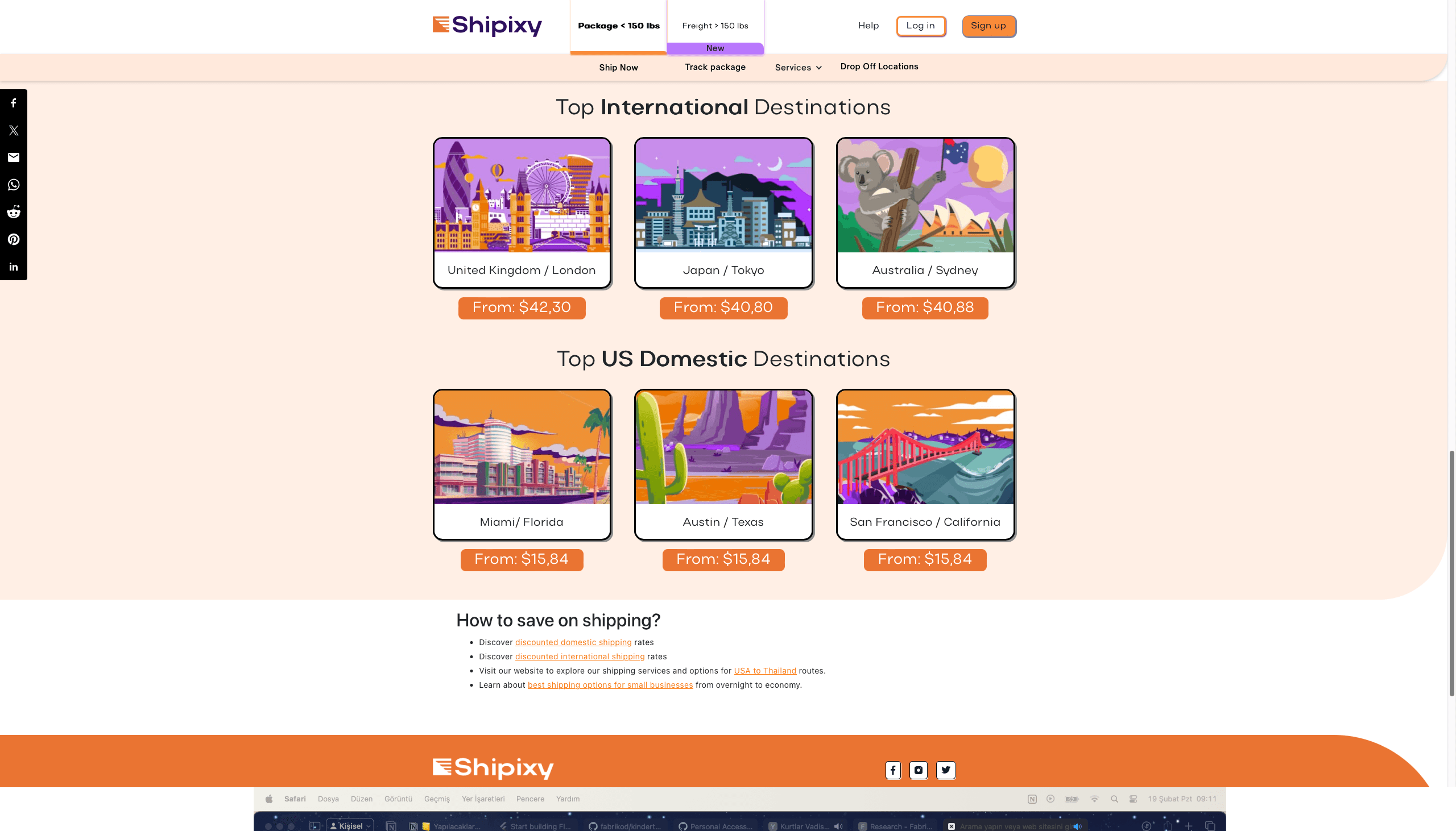 In the Top Destinations section, we created a dynamic structure on the page using small animations.
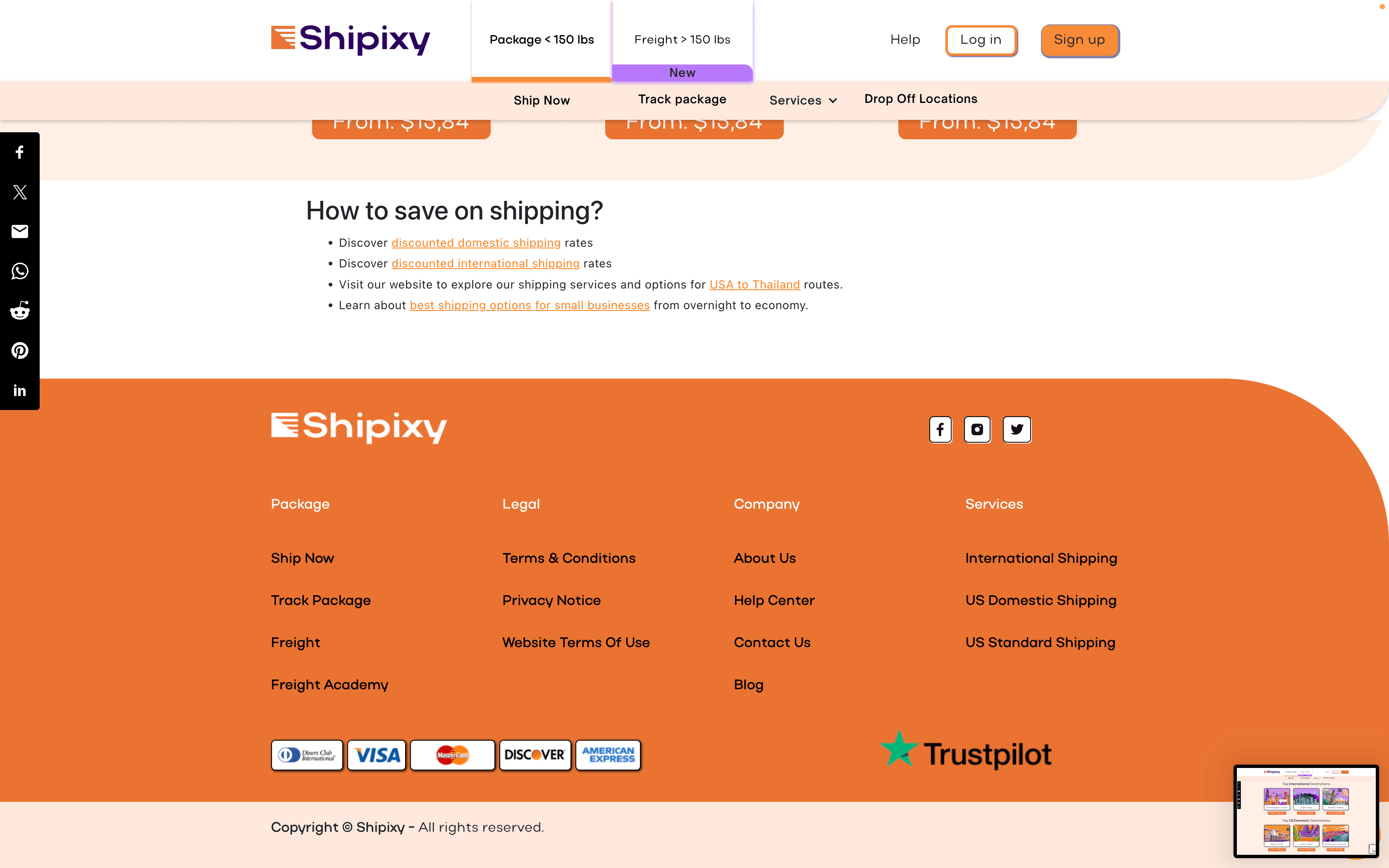 The Bottom Navbar section reveals how many pages the project encompasses. These pages include numerous functions where users can make payments, perform user transactions, get information about their shipments, and be informed about pricing. Shipixy's ability to provide all these services benefits greatly from Webflow's design features, no-code component creation, and the compatibility of embedded codes with the website's functions.
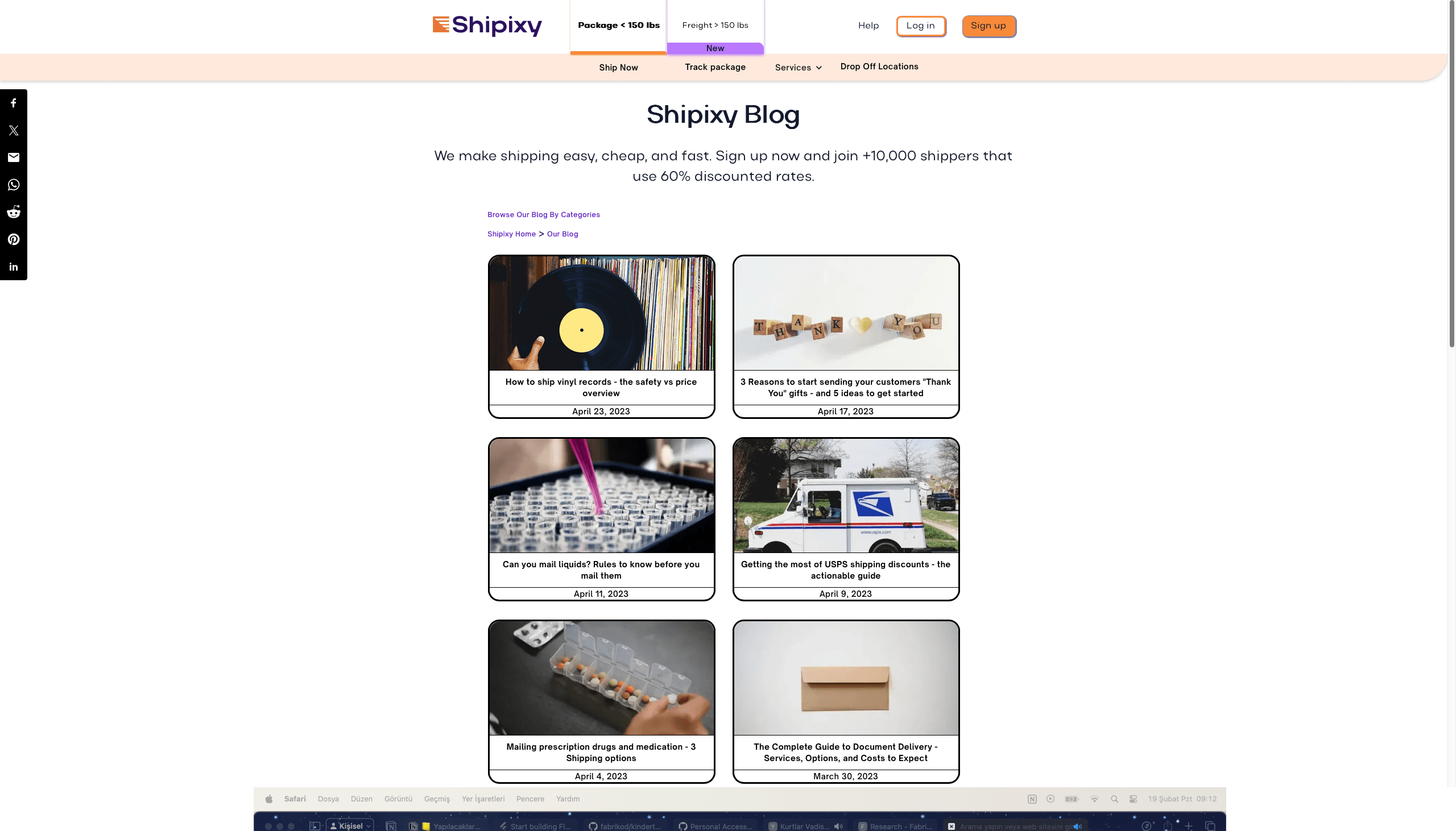 The Shipixy Blog page is one of the most efficiently used pages with Webflow. Everything on this page was done using Webflow. Webflow's CMS infrastructure allowed us to create a simple and usable blog page. You can easily add a blog post to your site, update existing blogs, or delete blogs you consider outdated through Webflow's admin panel. You can also manage your blog writers from the admin panel.
Fabrikod's Shipixy and Ship7 projects are proof of how successful websites can be created by effectively using Webflow's powerful design and development tools. Both sites, with their modern design, user-friendly interface, and customized functionalities, have strengthened the online presence of brands. Fabrikod has succeeded in adding value to its customers by using the Webflow platform for these projects.
Shipixy and Ship7 are excellent examples of how Fabrikod can develop impressive and functional websites using Webflow. Both sites are of high standards in terms of visual appeal and user experience, enhancing the digital assets of brands. Thanks to the flexibility and customization features of Webflow, the Fabrikod team has been able to create websites that meet and exceed the expectations of their customers.
